Wednesday, April 30, 2014
Endless fun with temperature anomolies
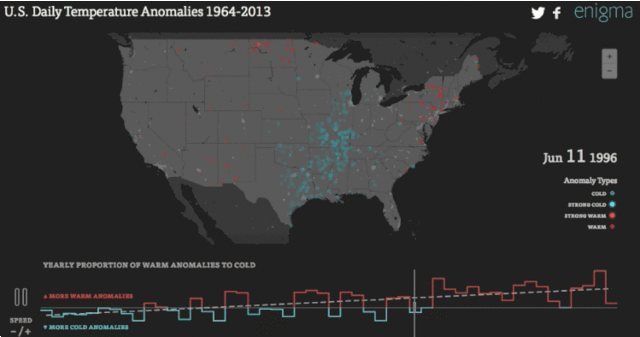
The data crunchers over at Enigma decided
to see how many of America's temperature anomalies--days in which the
minimum and maximum temperatures went off the historical charts--skewed
hot and cold over time. So they've made this interactive visualization tool that's sure to suck down hours of time for any of you weather geeks out there. Honestly, this thing is amazing. For a mind-puddling show zip to the beginning of February of 1996 and watch the animation servers get crushed by the 1996 perfect storm that hammered the country that winter.
Subscribe to:
Post Comments (Atom)
No comments:
Post a Comment